Beautiful bar plots with matplotlib
In this post, I will explain how to create beautiful bar plots with matplotlib. The default style and colors used in matplotlib are kind of ugly, fortunately, it is possible to change the rendering of the plots pretty easily. For example, we can look at the matplotlib styles available in our system with
plt.style.available
and then we can choose from this list one of the styles. For example to use the ggplot style we can use the following line of code:
plt.style.use('ggplot')
But we can do better!
Suppose we have data about the percentage of expenses we made in the last month and we want to show them in a bar chart (Fig 1). We can easily do it with pandas
fig, ax = plt.subplots(figsize=(7,4))
df.plot(kind='barh', legend = False, ax=ax)
ax.set_xlabel('Fraction')
ax.set_ylabel('Transaction Type')
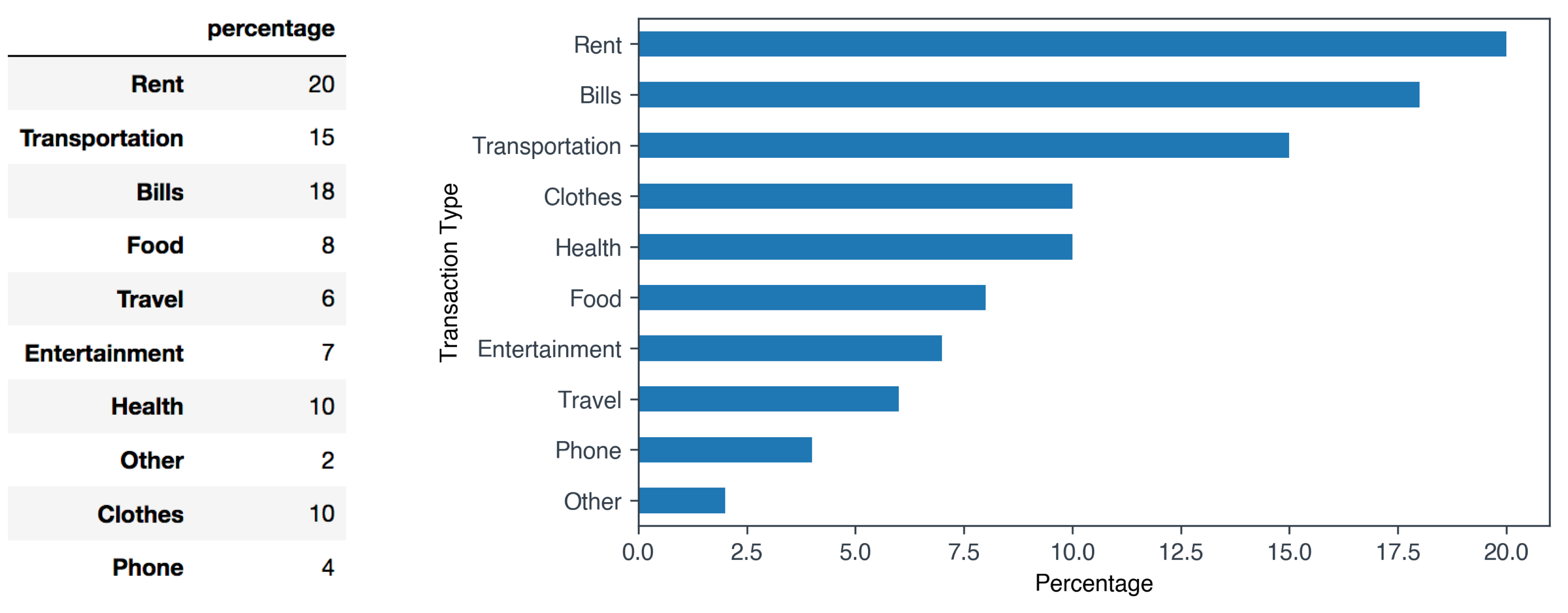
Fig 1. Expense data
Improving the style of the bar plot
As you can see, the standard matplotlib style is pretty basic and there is a lot of room for aesthetically improving our original plot. We can use colors that are not too bright, improve the axis style and remove all the elements of the plot that are visually useless such as the top and right spines. In Fig 1 you can see the final version of our bar plot.
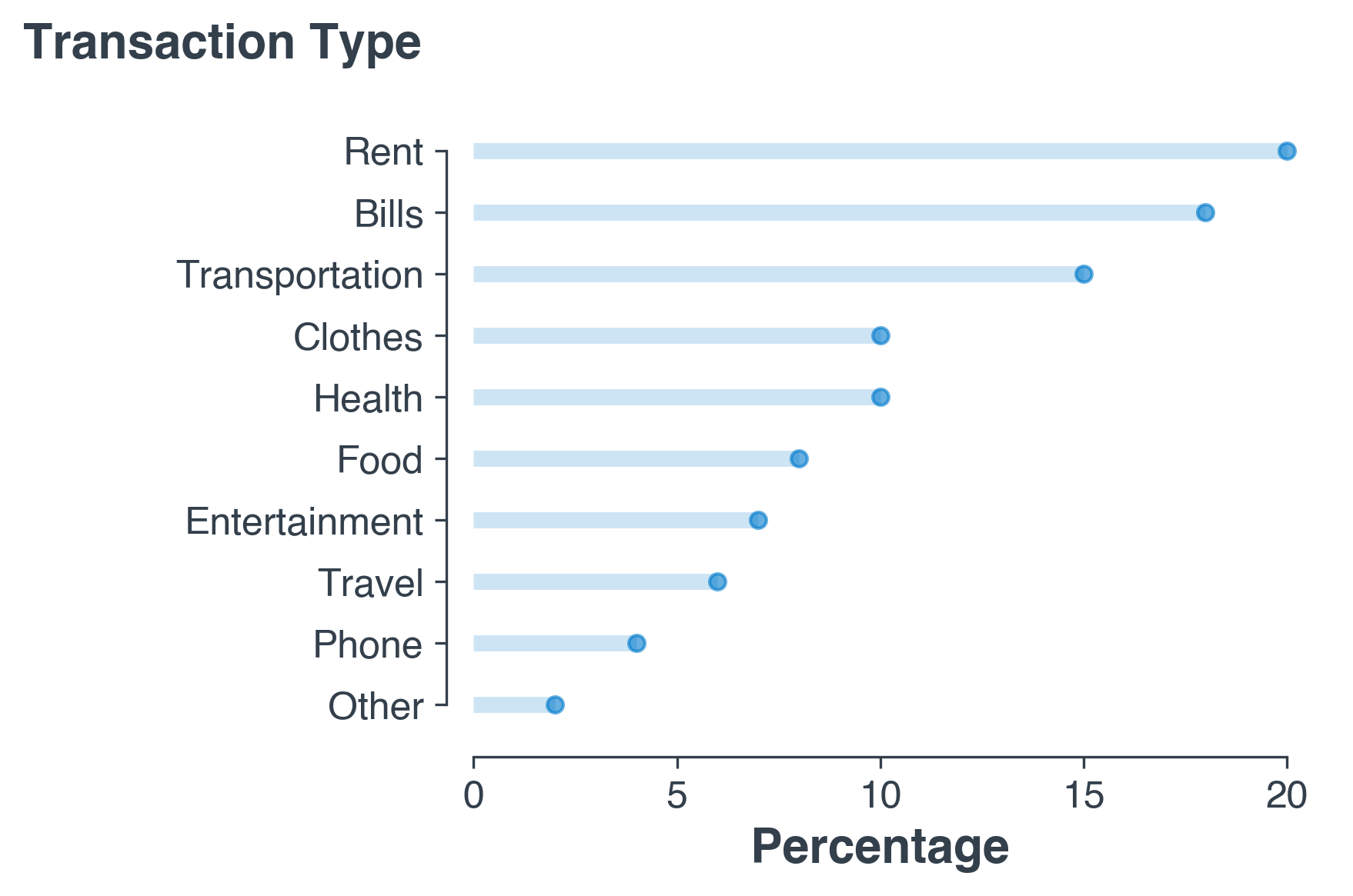
Fig 2. Our final bar plot. Better right?!
Now, I will illustrate the main steps I used to improve the rendering of our expenses plot. If you want to skip the explaination, you can find the full code at the end of this post.
- Change font.
First, we will change the fonts of the plot. If the font you specify is not available in your system, you can read the [blog post] I wrote a while back explaining how to install new custom fonts in matplotlib.
plt.rcParams['font.family'] = 'sans-serif' plt.rcParams['font.sans-serif'] = 'Helvetica' - Set styles for axes.
The next aesthetic improvement regards the style of the chart axis. In order to make them nicer, we will set the axis color to a dark grey and we will reduce the width of the axis.
plt.rcParams['axes.edgecolor']='#333F4B' plt.rcParams['axes.linewidth']=0.8 plt.rcParams['xtick.color']='#333F4B' plt.rcParams['ytick.color']='#333F4B' - Create the actual bar plot.
Now we need to plot the actual bar plot! First we create a numeric placeholder for the y-axis.
my_range=list(range(1,len(df.index)+1))Then we create for each expense type an horizontal line that starts at x = 0 with the length represented by the specific expense percentage value.
fig, ax = plt.subplots(figsize=(5,3.5))
plt.hlines(y=my_range, xmin=0, xmax=df['percentage'], color='#007acc', alpha=0.2, linewidth=5)
Similarly to a lollipop plot, we add for each expense type a dot at the level of the expense percentage value.
plt.plot(df['percentage'], my_range, "o", markersize=5, color='#007acc', alpha=0.6)
- Change the lables style.
# set labels style ax.set_xlabel('Percentage', fontsize=15, fontweight='black', color = '#333F4B') ax.set_ylabel('') - Change the style of the axis spines.
In the last step we choose a different style for the axis spines.
# change the style of the axis spines
ax.spines['top'].set_visible(False)
ax.spines['right'].set_visible(False)
ax.spines['left'].set_bounds((1, len(my_range)))
ax.set_xlim(0,25)
# add some space between the axis and the plot
ax.spines['left'].set_position(('outward', 8))
ax.spines['bottom'].set_position(('outward', 5))
That’s it! With few simple changes we have considerably improved the rendering of of plot! Here you can find the final notebook containing also a version with a vertical bar plot [notebook]
Code
# import libraries
import pandas as pd
import matplotlib.pyplot as plt
import numpy as np
%matplotlib inline

# set font
plt.rcParams['font.family'] = 'sans-serif'
plt.rcParams['font.sans-serif'] = 'Helvetica'

# set the style of the axes and the text color
plt.rcParams['axes.edgecolor']='#333F4B'
plt.rcParams['axes.linewidth']=0.8
plt.rcParams['xtick.color']='#333F4B'
plt.rcParams['ytick.color']='#333F4B'
plt.rcParams['text.color']='#333F4B'

# create some fake data
percentages = pd.Series([20, 15, 18, 8, 6, 7, 10, 2, 10, 4],
                        index=['Rent', 'Transportation', 'Bills', 'Food',
                               'Travel', 'Entertainment', 'Health', 'Other', 'Clothes', 'Phone'])
df = pd.DataFrame({'percentage' : percentages})
df = df.sort_values(by='percentage')

# we first need a numeric placeholder for the y axis
my_range=list(range(1,len(df.index)+1))

fig, ax = plt.subplots(figsize=(5,3.5))

# create for each expense type an horizontal line that starts at x = 0 with the length
# represented by the specific expense percentage value.
plt.hlines(y=my_range, xmin=0, xmax=df['percentage'], color='#007ACC', alpha=0.2, linewidth=5)

# create for each expense type a dot at the level of the expense percentage value
plt.plot(df['percentage'], my_range, "o", markersize=5, color='#007ACC', alpha=0.6)

# set labels
ax.set_xlabel('Percentage', fontsize=15, fontweight='black', color = '#333F4B')
ax.set_ylabel('')

# set axis
ax.tick_params(axis='both', which='major', labelsize=12)
plt.yticks(my_range, df.index)

# add an horizonal label for the y axis
fig.text(-0.23, 0.96, 'Transaction Type', fontsize=15, fontweight='black', color = '#333F4B')

# change the style of the axis spines
ax.spines['top'].set_visible(False)
ax.spines['right'].set_visible(False)

ax.spines['left'].set_bounds((1, len(my_range)))
ax.set_xlim(0,25)

ax.spines['left'].set_position(('outward', 8))
ax.spines['bottom'].set_position(('outward', 5))

plt.savefig('hist2.png', dpi=300, bbox_inches='tight')