Pandas: plot the values of a groupby on multiple columns
This is just a pandas programming note that explains how to plot in a fast way different categories contained in a groupby on multiple columns, generating a two level MultiIndex.
Suppose you have a dataset containing credit card transactions, including:
- the date of the transaction
- the credit card number
- the type of the expense
- the amount of the transaction
Since this kind of data it is not freely available for privacy reasons, I generated a fake dataset using the python library Faker, that generates fake data for you. In Fig 1. you can see such generated data.
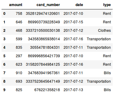
Fig 1. Data generated with the python module Faker.
Now suppose we would like to see the daily number of transactions made for each expense type. How can we do that? Well it is pretty simple, we just need to use the groupby() method, grouping the data by date and type and then plot it!
#plot data
fig, ax = plt.subplots(figsize=(15,7))
data.groupby(['date','type']).count()['amount'].plot(ax=ax)
Let’s see the result!
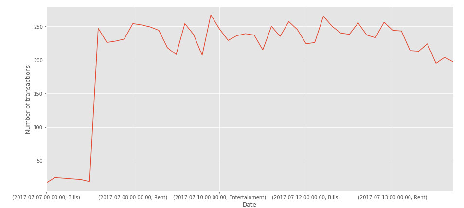
Fig 2. Uhm.. there is something wrong..
What happend here? We have just one line! This probably means that there is something wrong in how the data is represented in our dataframe..
In Fig 3. (left), we have an excerpt of our dataframe after we apply the groupby() to the data. As we can see, the daily category are correctly grouped, but we do not have a series of value for each expense type!
How can we do that? We can use the unstack() method (doc).
What this function does is basically pivoting a level of the row index (in this case the type of the expense) to the column axis as shown in Fig 3. (right).
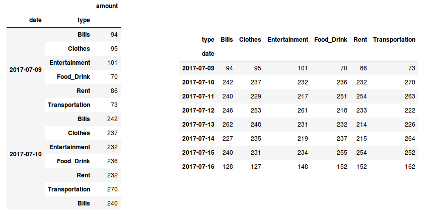
Fig 3. Our grouped data before (left) and after applying the unstack() method (right)
If you want to understand more about stacking, unstacking and pivoting tables with Pandas, give a look at this nice explanation given by Nikolay Grozev in his post. Now since our data is correctly represented, we can finally plot the daily number of transactions made for each expense type:
# plot data
fig, ax = plt.subplots(figsize=(15,7))
# use unstack()
data.groupby(['date','type']).count()['amount'].unstack().plot(ax=ax)
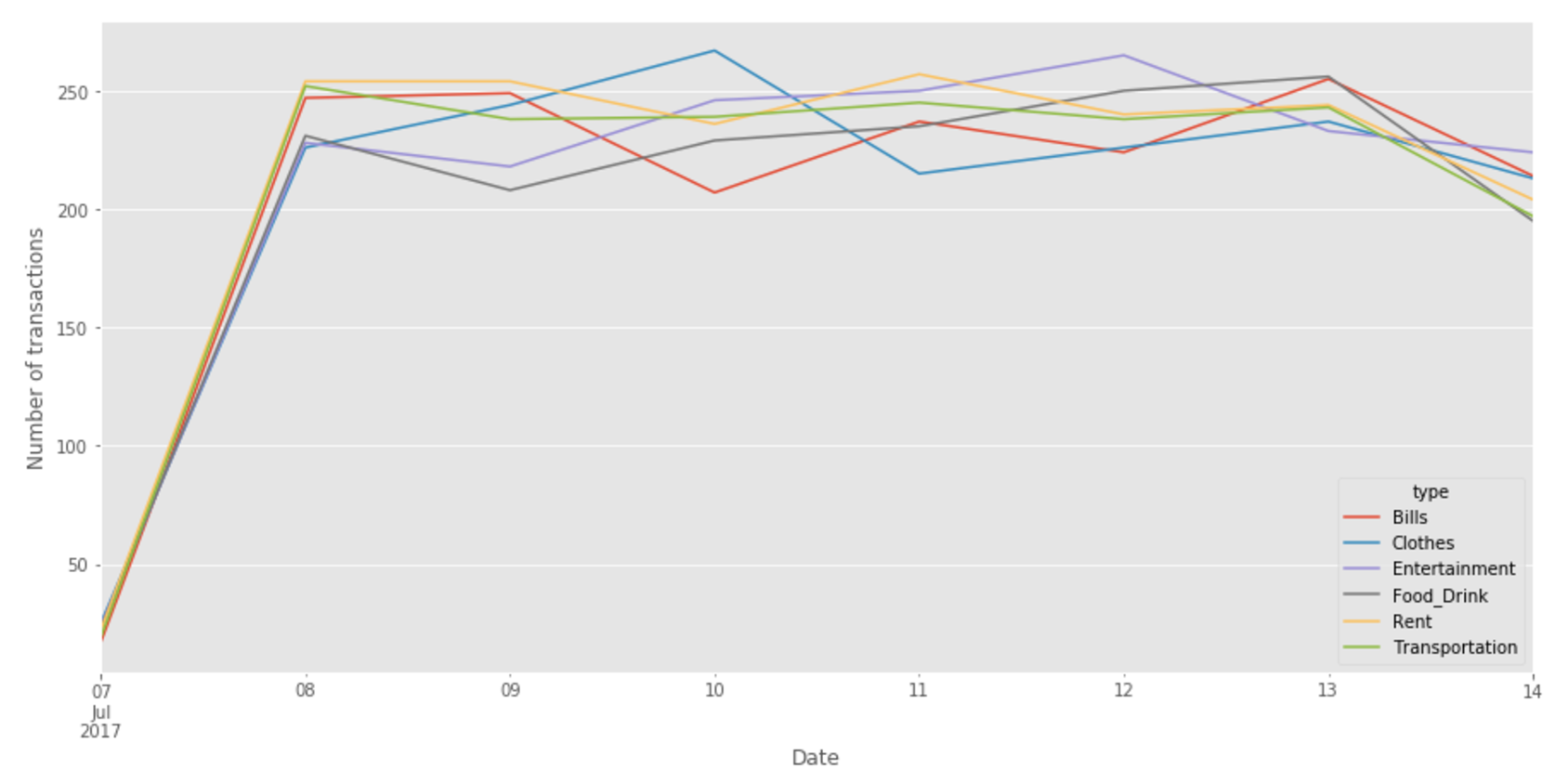
Fig 4. Our final plot!
You can see the complete code in this [notebook]