Pandas & Matplotlib: personalize the date format in a bar chart
Yesterday, in the office, one of my colleague stumbled upon a problem that seemed really simple at first. He wanted to change the format of the dates on the x-axis in a simple bar chart with data read from a csv file. A really simple problem right? Well it happend that we spent quite some time in finding a simple and clean solution! We looked at several answers on Google and Stackoverflow, but nothing seemed to work. Finally I was able to came up with a solution that I will briefly explain here. (or you can look directly at this [notebook])
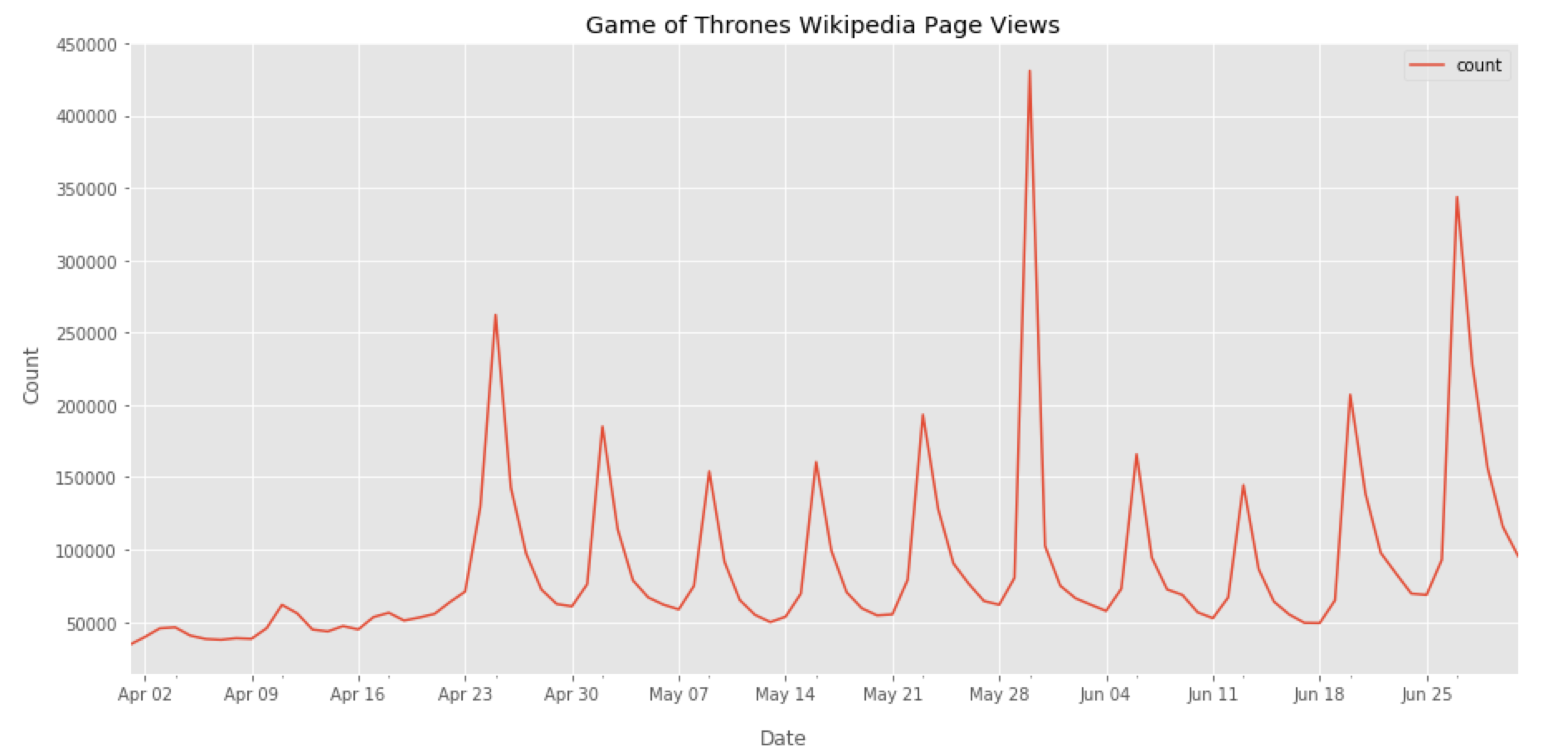
For this purpose I downloaded the timeseries of the Game of Thrones Wikipedia page views during Season 7 from [here]. At first I simply plotted a line chart using this code:
#import libraries
import pandas as pd
import matplotlib.pyplot as plt
import matplotlib.dates as mdates
%matplotlib inline

#read data from csv
data = pd.read_csv('data.csv', usecols=['date','count'], parse_dates=['date'])
#set date as index
data.set_index('date',inplace=True)

#plot data
fig, ax = plt.subplots(figsize=(15,7))
data.plot(ax=ax)

#set ticks every week
ax.xaxis.set_major_locator(mdates.WeekdayLocator())
#set major ticks format
ax.xaxis.set_major_formatter(mdates.DateFormatter('%b %d'))

Fig 1. Here you can see the number of page views of the Game of Thrones Wikipedia page. We can clearly see the peaks in the proximity of each episodes!
As you can see everything seems fine, the labels on the x-axis are well formatted with a label every week. What if we want to plot a bar chart instead? We can try to use the option kind=’bar’ in the pandas plot() function
data.plot(kind='bar', ax=ax)
When we run the code again, we have the following error:
ValueError: DateFormatter found a value of x=0, which is an illegal date. This usually occurs because you have not informed the axis that it is plotting dates, e.g., with ax.xaxis_date()
and adding ax.xaxis_date() as suggested does not solve the problem! I tried to make the code work with the pandas plot() function but I couldn’t find a solution. So after spending some time looking around, I decided to give up and started to use the matplotlib bar() function
ax.bar(data.index, data['count'])
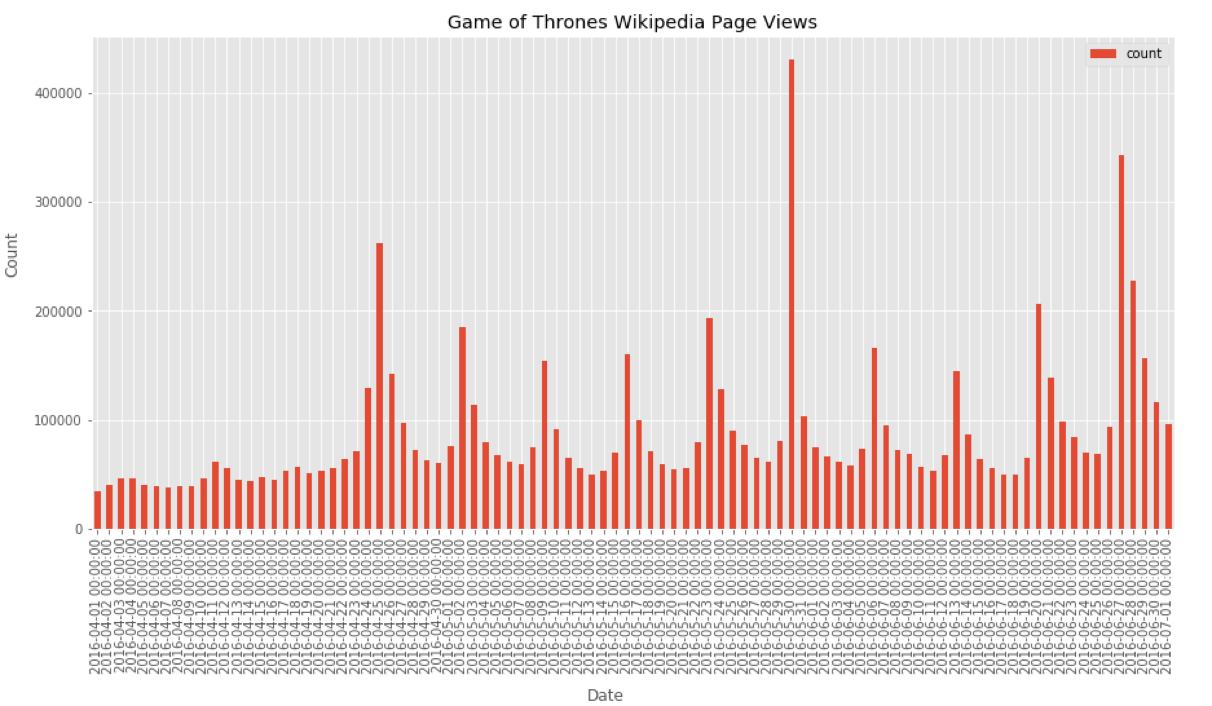
This is what we have

Fig 2. We need to fix the date format!
The date labels formatted in this way are ugly! So let’s use the matplotlib DateFormatter to make them prettier…
#set ticks every week
ax.xaxis.set_major_locator(mdates.WeekdayLocator())
#set major ticks format
ax.xaxis.set_major_formatter(mdates.DateFormatter('%b %d'))

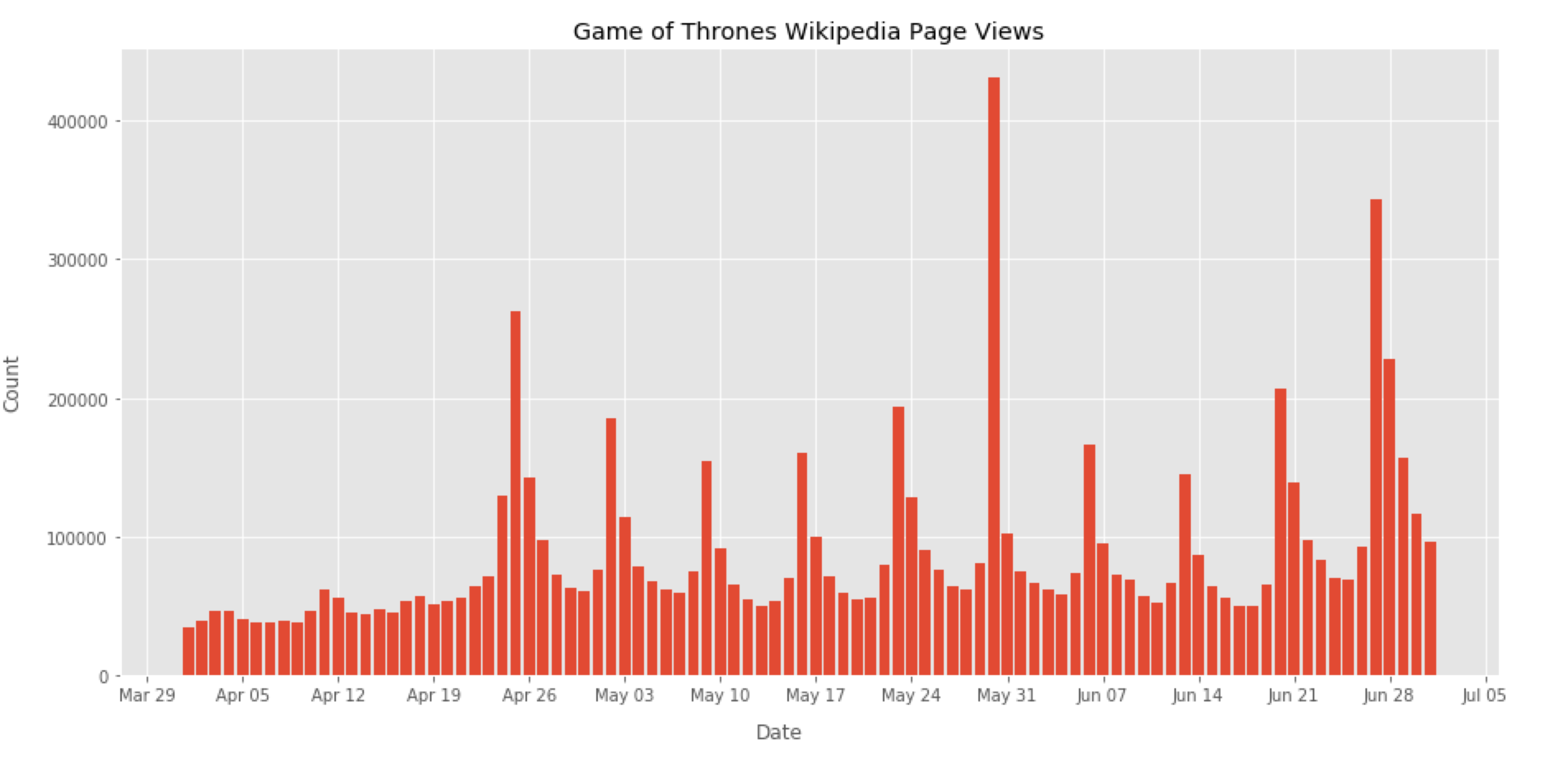
Fig 3. Finally!
… and that’s it! I hope this would help! Here you can find the code and the data that generated the plot in Fig 3. [link]
NOTE: If you are interseted in a short and clear way to understand the python visualization world with pandas and matplotlib here there is a great resource.